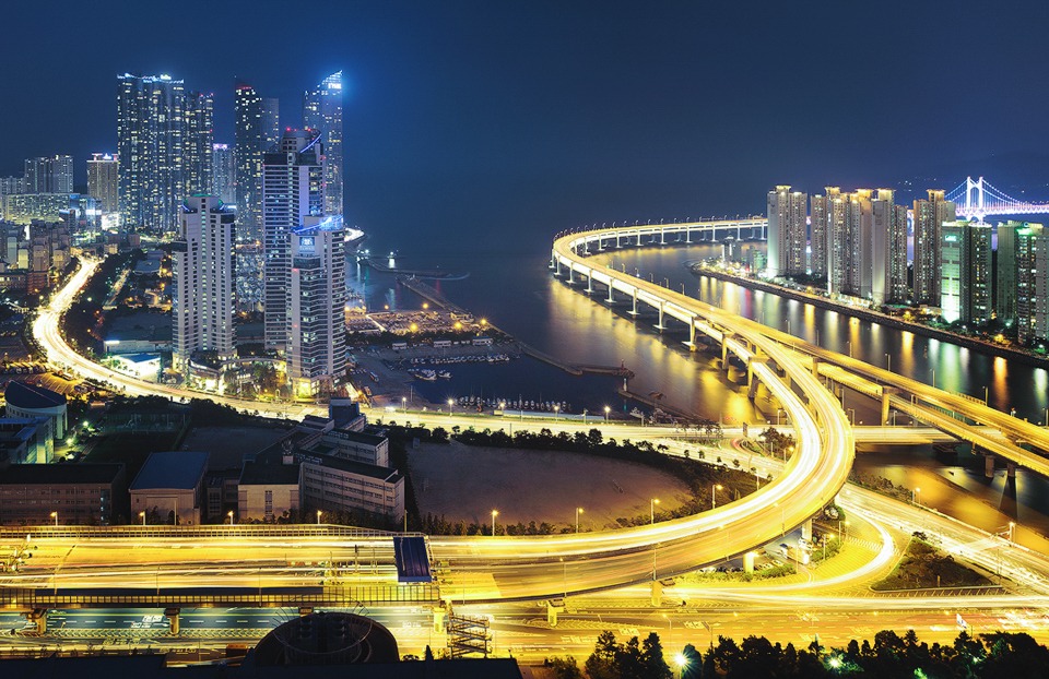
Busan Light Trails – Workflow Included
Busan Light Trails
This is a quick note to say Happy holidays to anyone and everyone who has followed my work this year. I hope 2015 brings you joy and inspiration in all areas of your life!
Jimmy McIntyre
The Cool Bits – Technical Info
Processing Time: 45 minutes
Exposure Blending method: Luminosity Masks
No. of Exposures: 21
EV Range: N/A
Aperture: From f/8 to f/10
ISO: 100
Focal Length: 40mm
Lens: Sigma 24mm-70mm f/2.8
Camera: Nikon D800
Plugins: Topaz DeNoise & Nik Color Efex
Luminosity Masks: Used to recover the over-exposed areas in the buildings
Workflow Explanation – Busan Light Trails
To learn my post-processing techniques, feel free to check out my courses: The Art of Digital Blending & The Art of Cityscape Photography
Today’s image is a four-tiled vertical panorama, comprised of 21 exposures that were blended using luminosity masks.
Shooting The Scene
I shot this shortly after being asked to leave Korea’s second highest helipad by security. You can see the image I captured from there, here: We Are The Zenith
I could have shot this scene in a single frame at 18mm. However, the reason why so many digital photographers choose to shoot portrait panoramas at a larger focal distance (in this case 40mm), instead of capturing all in one wide frame, is because it leaves us with fewer distortions, and potentially a sharper image with more information.
Also, although we’re only working with a difference of 20mm in focal distance, there is still a small difference in compression between the foreground and background elements, which can strongly influence the dynamics of the image.
I manually shot each exposure, rather than auto-bracketing.
For the first tile, I started by shooting a base exposure for the left side of the image. I then manually bracketed down 1 stop until I had covered every over-exposed area. The brightest part of the image is the I’Park sign on the tallest building in the middle. I needed to go four stops lower than my base exposure to expose for this. Here are the exposures that I used in the blending process for the first tile:

Once I’d covered the range of light in that frame, I then went back to my base exposure settings, and shot multiple frames in order to capture as many car trails as possible.
When I was happy with exposures for the first tile, I then swiveled the camera to the right and did exactly the same for the next tile, and the two other tiles after that. In the end, I used 14 exposures in total in the blending process, and seven more for the light trails
In post, I blended exposures for each tile individually in Photoshop before stitching all of the tiles together. My two goals in this initial phase were to recover the blown out highlights in the buildings, with the darker exposures, and to blend in the car light trails.
Using luminosity masks, it was a straightforward process to isolate the highlights. I was able to make a great selection with a Brights 2 mask, as you see below.

By blending in the lower exposures at a low opacity, between 10% and 20%, I was able to make a nice, natural blend. Final result below.

With the highlights taken care of, I then layered in multiple car trail layers and blended them by changing the Blend Mode of each one to Lighten. Since I was processing each tile individually, I saved each tile workflow as a PSD, so I could return to it later. I then flattened the image and saved it as a Tiff.
After going through this process with all four tiles, I was left with four Tiffs that had a good dynamic range of light, and a decent amount of car trails. I then stitched them in Photoshop (File>Automate>Photomerge).
They stitched very nicely, although there was some slight perspective distortion to correct. This was cleaned up quickly using Photoshop’s Lens Correction (Filter>Lens Correction).
To give the image more energy, I used the Pro Contrast filter in Nik Color Efex, which created some strong local contrast, and made the buildings stand out more. I then de-saturated many of the colours in the image, apart from the blues and yellows, which I enhanced. I particularly enjoy pairing up those two colours in modern cityscape shots.
And that’s it!
I actually shot this many months ago, but never published it on my blog as I didn’t like the empty space in the middle of the image. But coming back to it recently, I thought the workflow may be appreciated by some of you 🙂
Base tiles used in post-processing

This entry was posted on Monday, December 29th, 2014 at 1:27 pm
You can follow any responses to this entry through the RSS 2.0 feed.


It’s still a very impressive image, thank you for your workflow. It explains why I struggled with my 3 auto bracket exposure for city landscape at nights. Looks nowhere near as sharp as yours. Have a happy new year Jimmy.
Well done. How did you manage that vantage point? I love following your workflow it is very efficient and intuitive once you understand the blending process. Your courses were a great help…
VR
Gary
Thanks a ton Jimmy for your informative article. I’ve been using your “Detail Enhancer” for a while now and I love it! It definitely added the extra detail which was missing in my pictures.
I had tried shooting recently, everything went fine ( stitching, covered area etc. ). The only issue I encountered was that when PS stitched the photos, one frame had a lighter exposure and another had darker which made a prominent line appear in the stitch ( even shooting all the exposures at same manual setting ). It would be really great if you can help me blend the stitch seamlessly.
Fantastic photo and very insightful to see the workflow. One thing I would love to know is: what blending technique do you use when your subject is constantly moving – e.g. trees – and therefore the different exposures are impossible to align?
I always appreciate seeing your workflow Jimmy and this is no exception. For me perhaps, the foreground road-way and light-trails are a little hot in comparison to the more subdued buildings and industrial complex. Do you agree>
That’s exactly what I was going for 😀